A Review by Sebastian Schlueter
Introduction
What is it about film, that makes our heart sing? Why do people still shoot film, when digital is so convenient to use? There must be something that goes beyond detail, sharpness, precise color reproduction and this probably the "soul" of photography!
Beautiful grain, stunning tonality, bright and vivid colors, beautiful skin tones and subdued elegant shades of gray, all these attributes belong to certain type of film and wait to be explored, not only by the nostalgic enthusiast who is still drawn to the real medium, but also by the interested digital shooter, who is looking for a way to introduce the magic of film into the digital workflow.
Wouldn´t it be nice to find and easy way to combine the convenience of digital with the elegance of film?
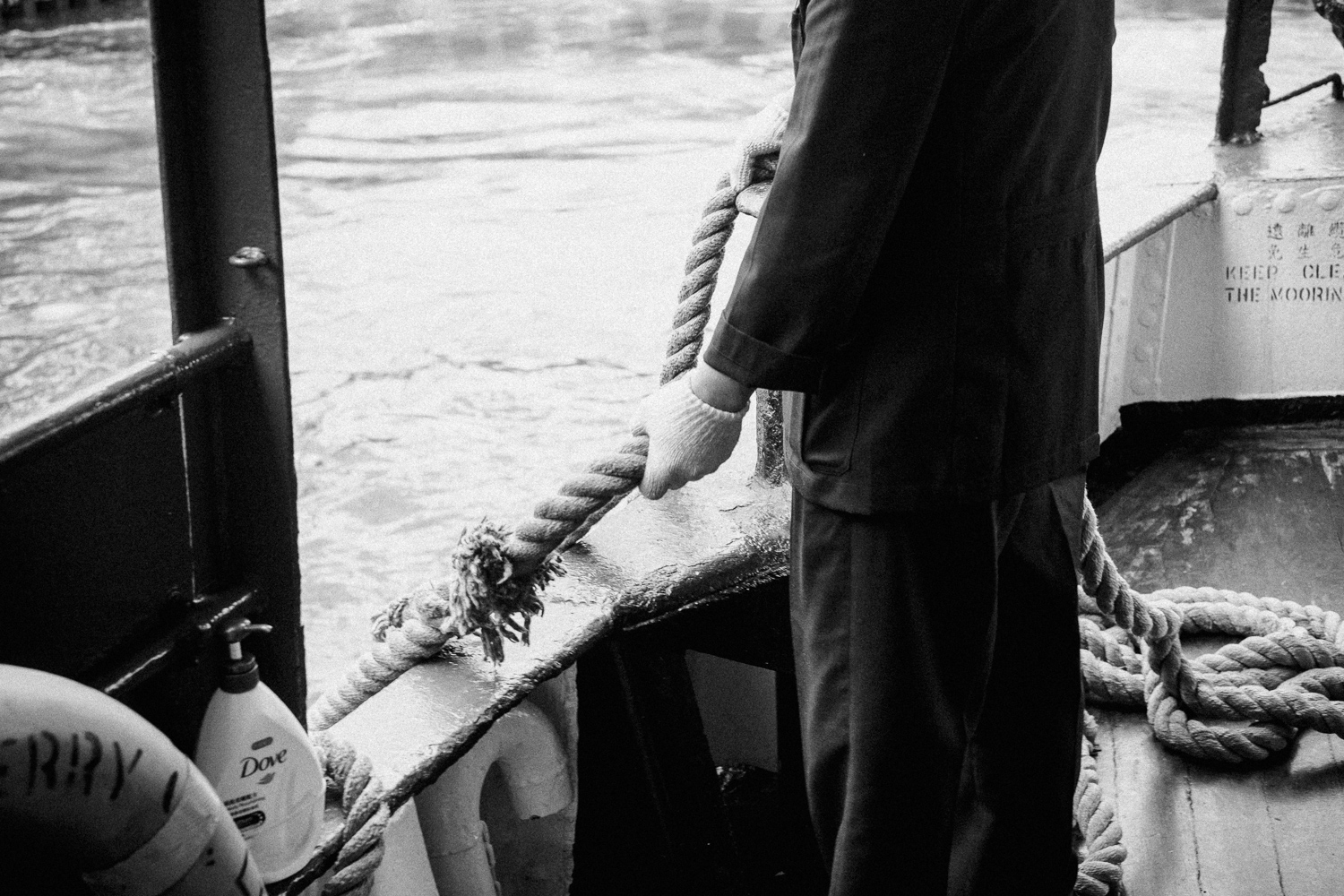
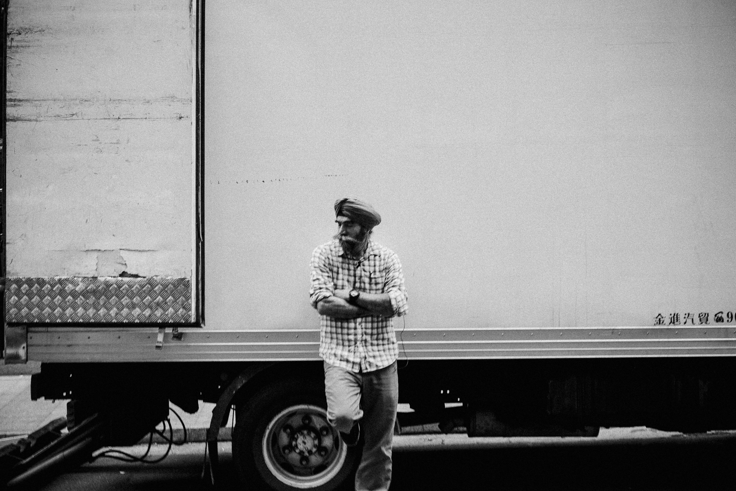
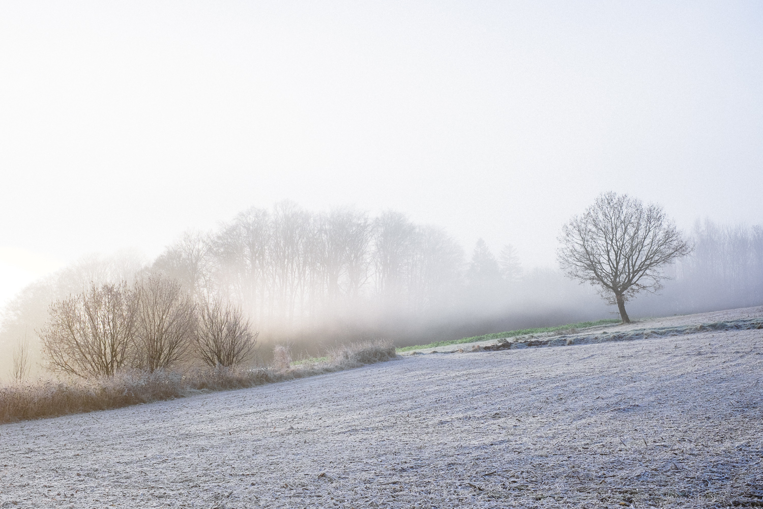
Kodak Portra 400 (image courtesy Johannes Meger)
The idea of film presets for Adobe Camera Raw and Lightroom is not new and there are many companies around who have already placed a product on the market. Recently RNI which stands for "REALLY NICE IMAGES" has announced the 4.0 version of their film presets and I was very eager to test them. The company is already known for its mobile app, that simulates real film stock on mobile phones. The sample images of their preset packages on their website really look convincing and they promise a "state of the art film simulation" experience. Can this promise be kept?
Before we get started with the review, Olly from RNI was kind enough to answer some questions to get a more detailed look behind the scenes of the company and their philosophy.
Interview with Olly from the RNI Team
Hi Olly, would you be so kind and tell me a bit about RNI as a company, where are you based and what is the background of the company?
Thanks Sebastian. For those not familiar with our products yet – RNI is a small team, an art & technology company based in London. Sometimes journalists refer to us as a startup but that's not entirely correct. Unlike typical startups RNI runs on profit and passion exclusively not on investments. For the last few years we've been focused on making digital photography output more human by turning to analog techniques for inspiration. And our latest products — RNI All Films 4 for professional desktop users, and RNI Films and RNI Flashback for mobile shooters are the direct result of this process.
What is it that you guys love about film and why do you produce presets for digital cameras to simulate the look of film?
That's a very good question and quite a fundamental one to what we do. For many creative people it's not enough just to capture what they see. It's more important to express how they feel, what we call bringing an emotional essence to their photography. And this is where film still can't be bet.
Many creators would agree that film has that delicate colour and tonal harmony, artistic flair and expressive power that digital still lacks. And this was our reason to start the quest for such processing tools capable of bringing digital imagery to life with minimal effort.
How do you produce or design the presets and how do you ensure that the presets looks like the simulated film brand?
To learn from film one needs to shoot film. So not surprisingly this is our starting point. In our current workflow the starting point is shooting colour charts and a range of real-world subjects using actual film stocks in parallel with a number of digital cameras of some popular brands.
Then comes time to use our RNI magic. A proprietary process that provides the initial match in Lightroom based on colour charts data. This is quite a technical stage but it is where the new preset starts getting it's initial shape, and where real film is first used to define the tonal and colour response of digital negatives.
Also at this stage we use our own versions of camera profiles. We extract more details from highlights making more image data available for further manipulations and providing more gradual film-like fading of details in highlighted areas.
The final stage of our process is also the most time-consuming one. After the initial match is done, we spend long hours, days and often months of creative tweaks to get things right. This includes tweaking skintones, sky, foliage and other important groups of colours using our range of real-life subjects captured on film and digital under various lighting conditions.
At RNI we believe only such a meticulous approach that combines both technology and creative input makes for some of the class leading image processing products out there.
What would you call best practice for using your presets? Do you for example adjust exposure and white balance first before you apply any RNI film presets?
Certainly. This is what we would recommend to do. Setting Brightness, Contrast and WB at the very beginning is a good idea. Also we would highly recommend reverting to this point before applying every new preset. This prevents Lightroom from accidentally inheriting some settings from the previously applied look and ensures every preset you apply looks exactly the way it has been designed.
Finally, what is your personal favorite preset?
That very much depends on the subject and desired look. Every time processing my images I spend a bit of time researching how different film groups and film brands work for my current shoot and then trying to stick to one, just to limit myself as if I were shooting real film.
Thanks, so much for your time Olly!
Thanks Sebastian! Great questions! Hope the answers will make it more bespoke and interesting for your audience.
Ilford Delta 3200
Why Film Presets
So why should anybody interested in the beautiful aesthetics of film to shoot digital and simulate the look of film in post-processing? Well, of course this idea is not new and was just a natural progression after digital photography overtook film in our daily lives. Everybody is used to the nostalgic look of film, either due to our memories from family albums, the look of iconic images from photographers like McCurry or Cartier-Bresson or even due to the beauty of modern wedding photography made popular by names like Jóse Villa or Elizabeth Messina. Not everybody is willing to abandon the benefits of digital to embrace the beauty of film. As a photographer who mainly shoots film for his personal or creative work, for a long time I thought that digital presets are not an option. Too many things that cannot or hardly be simulated, but after I started using presets from different companies, I have changed my mind again. For travel photography and documenting the personal life, presets can really streamline your workflow and can help to give a series of images a certain style or mood. We should clearly differentiate between photographers who want to play with presets in order to create a good looking image or hybrid shooters who want to match their digital work with analog film on a serious level.
Content of the package
RNI offers two different sets of film presets. There is a "Lite" set that contains a total number of 43 presets encompassing a whole variety of film stock. This includes slide film, color negative film, black and white film, vintage and instant film. The "Lite" pack already contains more film stock than you might need. Nevertheless, if you go for the "Pro" pack there is almost no major film stock left out and 69 film stocks are simulated in the pack. You can find everything from legends like Kodachrome and Tri-X as well as fancy stuff like Rollei Digibase. Both packs are rounded up with a "Toolkit" that helps to accentuate or fine tune the look of your work. Either preset pack will provide you with enough options and possibilities according to your taste. While I highly recommend experimenting with the variety of choices I also think you should limit yourself to a handful of films in order to make your style more consistent. Head over to Hamish Gill who came up first with this tip in his very interesting review of the RNI presets. For my review I decided to look only at film stock I shot in real life and this is Kodak Tri-X 400, Kodak Portra 400, Kodak Gold 200, Fuji Velvia and even though I unfortunately never had the chance to use it, I will also cover Kodachrome 64.
The grain and mood, all correspond to the real look of a Kodak TX400 scan. Wonderful simulation of this legendary black and white film.
Practice
While the package comes with an installer for Mac, it lacks one for your Windows machine. But if you are somewhat familiar with the folder structure of either Lightroom or ACR, you probably won´t have any problem to follow along the installation manual. Unfortunately there is no user handbook for the presets. It would be really helpful to get an idea of how each film stock works and how it will look like. I also miss instructions on how to use presets for the best possible result. Fortunately Olly from RNI gave us some advice in the interview on how to get started with the presets.
Like with any other presets that simulate the look of film there are key parameters that will be changed in order to match the digital file with the analog print. These parameters are foremost contrast and color. In order to compensate for the different color and contrast outputs from different camera manufacturers, RNI provides camera profiles which will automatically prepare the data from your camera for the RNI presets. In order to check whether your camera is supported or not, you can check on their website and see if your camera is listed on the huge list of supported cameras (scroll down all the way to the bottom of the site)
Exposure
When working with presets it is always a good habit to start with an image that has been corrected for exposure and color balance. Exposure is widely affecting the look of the image and this includes saturation and contrast. The initial correction goes towards an acceptable exposure value. It is very important that this value must be tweaked after the preset has been applied. As soon as you get used to this step you can start adjusting exposure later in the workflow and after the film preset has been selected. Your experience will tell you where to go with the slider for the intended look.
White Balance
White Balance is the second important key parameter and together with the "Tint" slider the white balance setting is totally changing the color balance and mood of the scene. This is obviously true for color but should not be neglected for black and white photographs as well. With some of the RNI film presets I found it very helpful to adjust white balance after the preset has been applied to fine tune skin tones or color balance. Skin tones are very important for photographers and as the presets shift color relationships in order to match the image to the desired film look it is inevitable to fine tune color control with these skin tones in mind. If a photograph looks odd and not as expected chances are good that moving the tint slider and correcting for a green or magenta cast will cure the problem. Unfortunately there is no shortcut. The auto white balance feature of Lightroom and the white balance tool will get you in the right direction but in the end it is up to you to decide which color balance setting works for you.
Skin Tones
With many of the traditional portrait film simulated in the package I found it hard to get good and pleasing skin tones with a single click. Even though the images has been carefully prepared, after a preset has been applied, skin tones seemed slightly off. Tweaking was often necessary. I have had the same experience with other film simulation presets and therefore I was used to it and I even expected a similar behavior with the RNI presets. However some of the presets are harder to correct in regards of skin tones than others.
While ideally we could be finished after the preset has been applied there is no rule that you should not touch the sliders anymore. The presets are a step towards a direction that has been inspired by a certain film, the decision of the final look however rests with the photographer. Having the whole workflow in our own hands is one of the biggest benefits a digital photographer normally has over an analog photographer. Honestly, the chemical process and the variables that come with film exposure and development can obviously not been completely simulated in a raw processor and even if we get close to a match, we might need to touch the sliders to adjust for light and mood of the photographed scene. For the final result "shadow contrast" is according to my personal experience the most important factor when it comes to tonality. Sometimes bringing up the shadows with the shadow slider and simultaneously lowering the blacks makes the difference between a nice try and a successful photograph.
Fuji Velvia 50
Film Variations
I just mentioned that film includes many variables. This goes even beyond the chemical process and does as well include the scanning process. All these variables often lead to variations that are nicely implemented in the RNI Pro package. Often encountered variations of a certain film look are included and can be found in the preset package as film variations. It is however even harder to judge whether these variations hold up with a real world film experience or not. I suggest using the variations and see if you like them for the certain image or not.
Fine Tuning and the RNI Toolkit
Shifting colors and manipulating contrast is not all we need for getting towards a believable film simulation. The output from analog cameras often looks softer, maybe somewhat distorted due to the use of less sophisticated lenses and of course to a certain amount grainy. The RNI toolkit is one way to solve this problem. You can address all those attributes by using a range of presets that deal with "analog softness", "fade", "contrast" and "vignetting". An additional feature that is called smart contrast attracted my attention. As I often encountered a lack of shadow contrast with color negative presets I thought this preset was the best way to deal with it. Unfortunately the preset always darkened the previously adjusted image in a way that further exposure adjustments had always been required. More often than not tweaking shadow contrast in the way described above, was my best bet.
Regardless of my reduced enthusiasm about the "Smart Contrast" feature I was pleasantly surprised by the very natural look of the grain and "analog softness" presets. All the basic film simulation presets come with a built in grain feature that suits the nature of the selected stock. The "grain" presets can bring them to a new level and provide dedicated grain simulations for a certain kind of ISO level and film size. The "analog softness" is just slightly reducing the punch of a digital image and shifts its appeal towards the natural harmony of an analog print. I found this feature one of the most intriguing aspects of the whole package.
Kodak Gold 200
Film vs. Digital
As I have now covered the basics of the RNI film package I want to go one step further and evaluate how the presets perform to create continuity over a series of images. I selected several very well known film stocks and wanted to see whether they are able to keep up with their analog counterpart.
Steve McCurry and Kodachrome 64
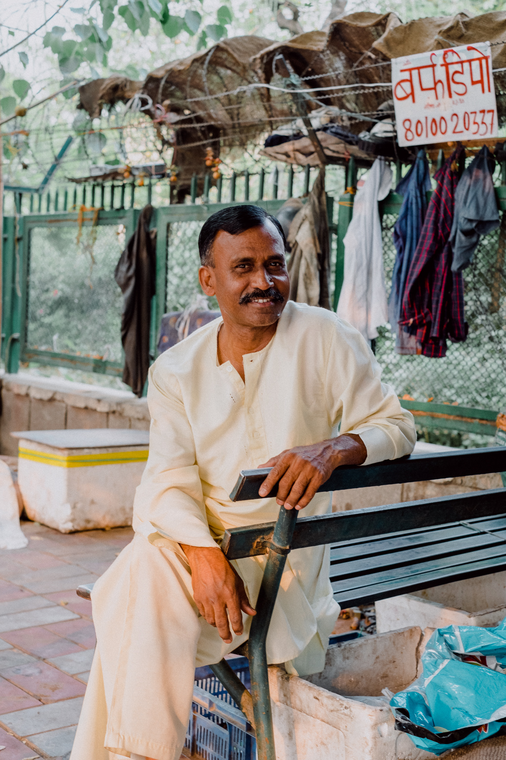
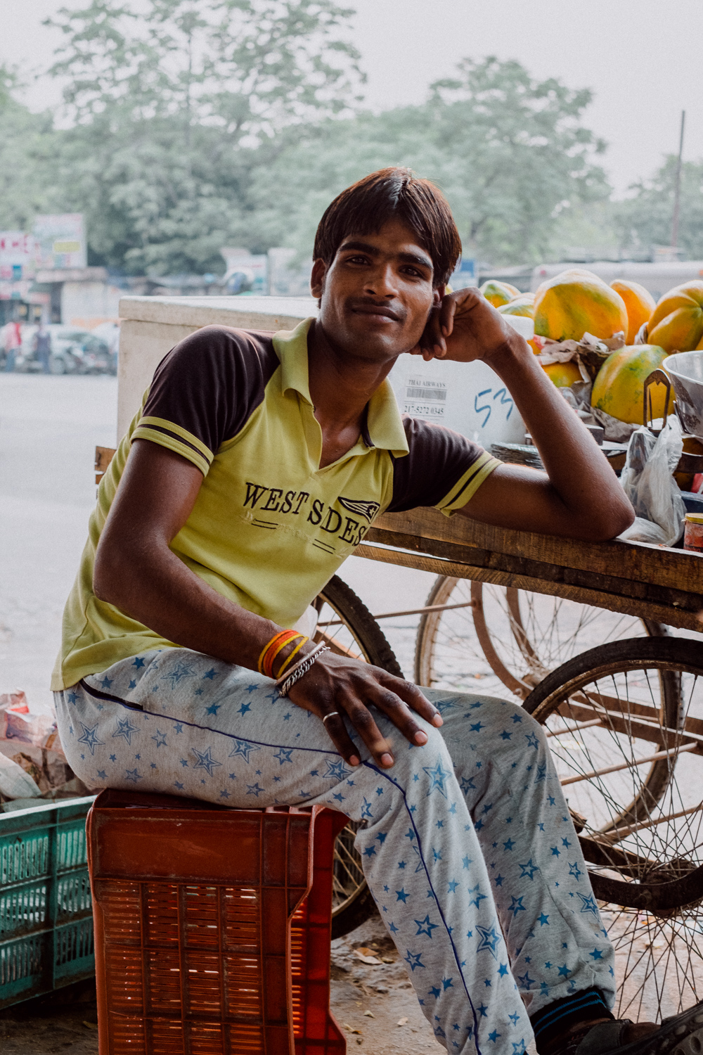
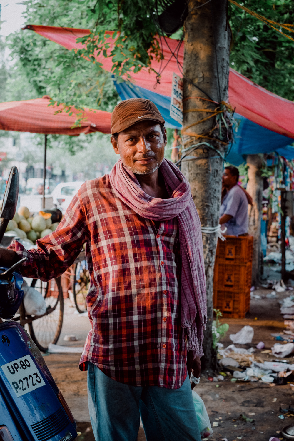
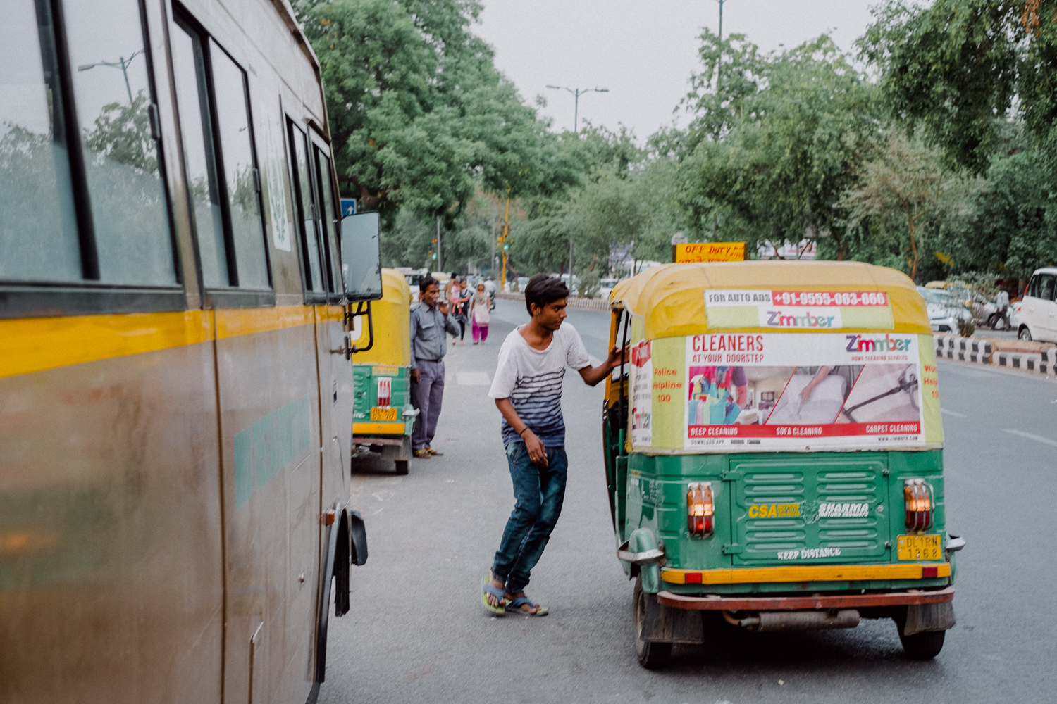
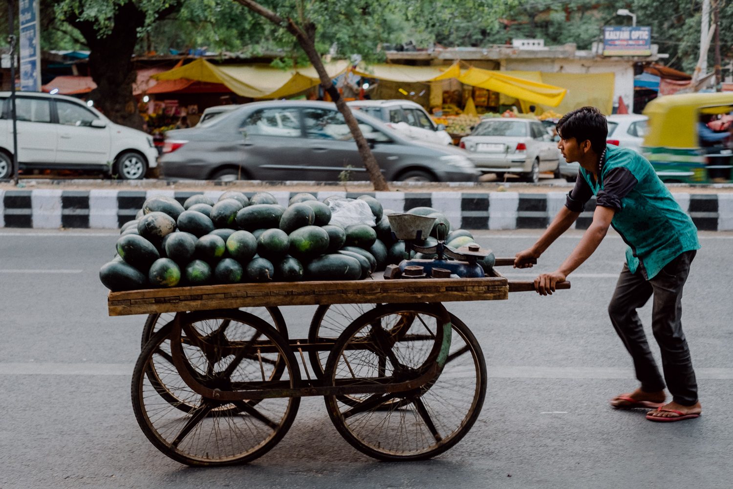
Maybe one of the most iconic films ever produced has unfortunately been discontinued in 2009 and the last roll has been processed in 2010. Steve McCurry known for his colorful travel photographs had the honor to shoot one of the last rolls of Kodachrome. He used this film over decades and literally shot thousands of rolls, an opportunity I sadly never had. So it is not easy to really evaluate the accuracy of the preset. Luckily I had the chance to scan several frames Kodachrome and from my experience and with reference to the images available online that have been shot with Kodachrome I was really convinced that RNI made a nice preset that gets very close to the unique and typical Kodachrome look. The example images have been shot in the streets of Delhi this summer and carefully processed using the Kodachrome 64 preset. The colors are vivid and the contrast is strong with a dominant shadow contrast. Highlights will be hugely cutoff similar to what you get scanning Kodachrome film. The overall look of a Kodachrome scan is always a bit on the dark side, depending on how the frame was exposed. This is nicely replicated by the RNI presets and I finally need to mention that RNI is the only company that included Kodachrome in the package.
Before RNI Preset - Raw from Fuji X-Pro2
After RNI Kodachrome 64


Steve McCurry: "(...)Velvia made everything so saturated and wildly over-the-top, too electric. Kodachrome had more poetry in it, a softness, an elegance. With digital photography, you gain many benefits [but] you have to put in post-production. [With Kodachrome,] you take it out of the box and the pictures are already brilliant."
Another example of the Kodak TX400 HC preset
Streetphotography and Kodak TX400
The one and only Kodak TX400! Press-Photography relied on this dinosaur of films ever since and it feels like this film has been around forever. The formula has slightly been changed over the years, but it is still probably the most versatile black and white film around. It can easily be pushed several stops and has been used by well known photographers in documentaries or streephotography series. With black and white film it can be hard to produce convincing presets. Color and tone need to be translated into shades of grey. The Tri-X 400 preset in the HC (high contrast) variation gives us the unique look of Tri-X. I was really blown away by the subtle film look of this preset. The grain and the tonalities match Tri-X extremely well. A good alternative to get a very good digital match to the real joy of shooting Kodak Tri-X.
Before - Raw from Fuji X-Pro2
After RNI Kodak TX400 Preset
Landscapes with Fujifilm Velvia 50
Fuji Velvia, maybe the most favorite slide film for landscapes photography, tends to really exaggerate a scene and introduces overly saturated colors with a bold contrast. In real life I was never drawn to this film, but the RNI preset works very well with landscapes. The preset works as expected, but the colors don´t go wild! This is much better than what I have seen from other presets. I played with the film preset of Fujifilm´s X-Series and their Velvia preset and I prefer the look of the RNI preset just because colors don´t get distorted. I am not experienced enough to judge whether it really comes close to the real Velvia, but I am satisfied with what it does to my digital files.
Before - Raw from Fujifilm X-E2
After - RNI Fuji Velvia 50 Preset
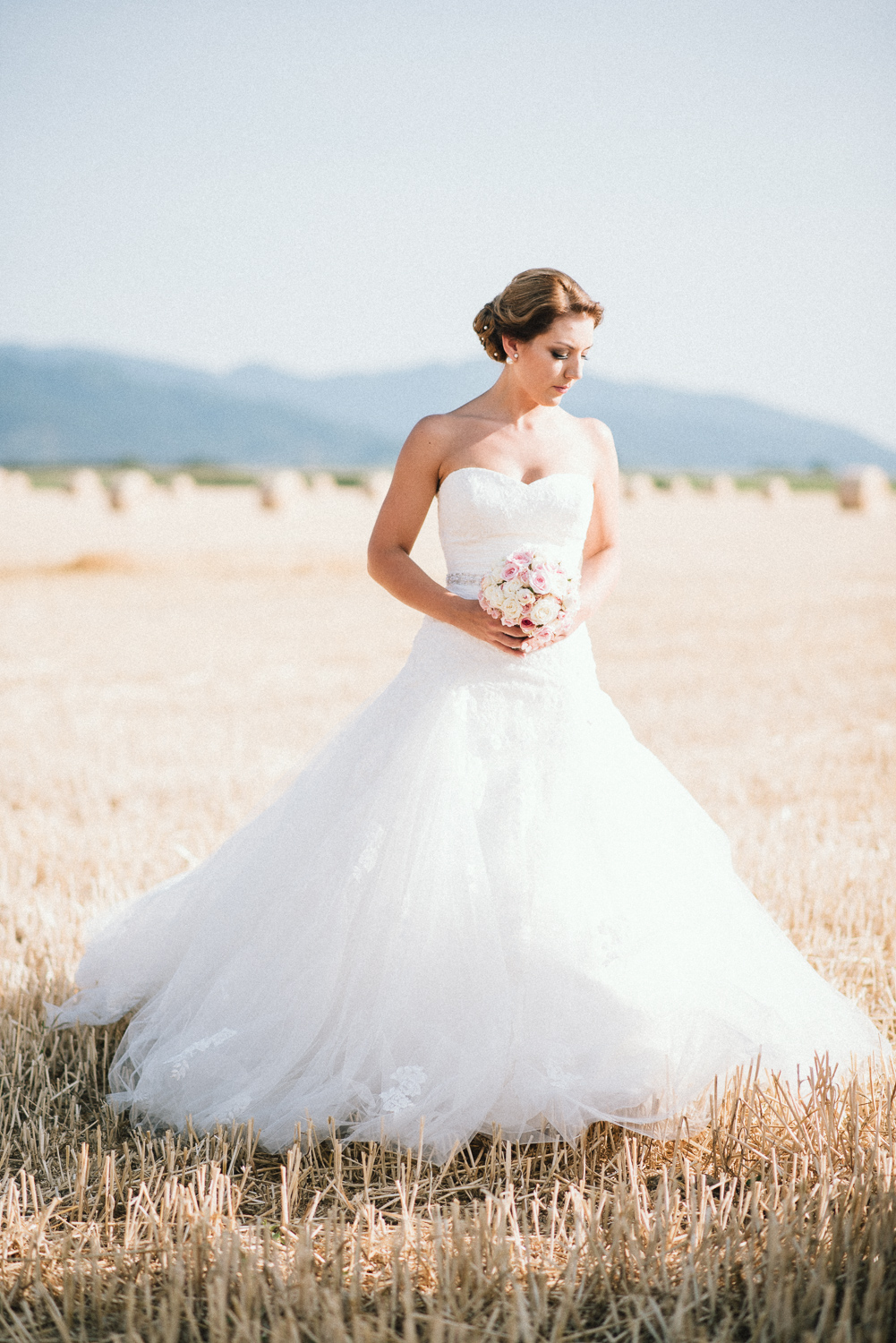
Wedding Photography ON Kodak Portra 400
Portra is my go to film and absolute favorite. I have shot many rolls of Portra and I was always happy how skin tone are rendered with this film. Up to now I was sure this is among other aspects the outstanding advantage of film. In order to learn whether RNI can keep up with these nice skin tones I asked Johannes Meger a friend of mine who is a really gifted wedding photographer if he would be interested in providing some raw files for this review. He gladly agreed and I had some nice portraits to experiment with all the presets by RNI.
Before - Raw from Nikon D750
After - RNI Kodak Portra 400 Preset
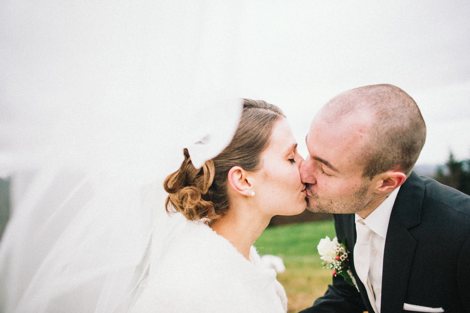

I mentioned already that skin tones are tricky and I processed all files with care. In the end the look of the files reminded me of Portra but it was long road to get there. Some images proofed to be harder to process than others but in the end they all required a certain amount of tweaking beyond what is covered by the RNI presets. I almost always had to touch the "Temperature" and or "Tint" slider even though the raw file was perfectly color balanced before the preset has been applied. I also found the shadow contrast is too weak to what I am used to by the scans I receive from the lab or do myself at home. So, nice wedding and portrait photographs can be done with the RNI presets but some work is required to give them a film like appeal. Skin tones however cannot compete with real film in my opinion. Of course it is still needs to be proofed whether digital files in general can hold up with film. Even though I am sure that RNI has put a lot of effort to get skin tones right, I think there is some room for improvement in this regards. Maybe they can address this in upcoming updates of the film presets.
Travel Photography on Kodak Gold 200
Before - Raw from Fujifilm X-Pro2
After - RNI Kodak Gold 200 Preset


I just recently fall in love with Kodak Gold 200, a consumer film by Kodak that is very versatile and can be used in many situations. The RNI preset for this filmworks nicely, but maybe a bit on the cold side. I am used to a rather warm rendering of colors when I scan Kodak Gold with my Kodak Pakon scanner and found the presets shift color balance a bit to the cool side. This can of course be easily corrected, but it is not a one click solution either. The overall appearance of the Kodak Gold preset is very convincing and I like the look of the preset a lot. Especially the photography of the birds soaring over the clips really looks like film in my opinion. You can easily produce very film like result using this preset!
Do They Look Like Film?
When I finally have to judge whether RNI Film presets can simulated a certain film type I think the presets really get you into the right direction. With a little bit of additional work and tweaking you get really close to a natural film look . Overall I was very pleased with most of the presets in the Pro pack. They certainly add a very film like feel to your digital files and especially the "analog softness" reduces the clinical sharpness of many digital cameras to a much more pleasing level. If you need to precisely match film with digital, you need to put a little bit more work into image processing in order to achieve the desired result.
In a blind test, where you don´t know if a file is a scan or a digital file, it might be hard to pick the digital, I am quite sure. But as soon as you are aware of the fine differences between the files, I am convinced most people will still embrace the beauty and fine aesthetics of film over digital. The presets however can be used to make a statement with your digital files. Stand out from the masses of image that are processed with Instagram filters and use RNI film presets to define your own style and make your own statement. Use the presets as a starting point. Make your own judgments, tweak and give your images you own voice based on the look of film!
Summary
My final conclusion is simple. RNI has done a surprisingly good job in simulating a huge variety of film and the presets nicely place themselves solidly in the market. They conquer VSCO with a really good product at a much more convenient price level. As the quality is similar to the much more expensive presets of VSCO, I recommend everybody who is interested in experimenting with the magic of film aesthetics to consider the RNI product. While there is of course always room for improvement, RNI has done a major step forward with the recent upgrade of the 4.0 version of their presets. I especially like the new camera profiles, the very versatile "Toolkit" and the wide variety of film stocks especially the exclusive film simulations like Kodachrome and Agfacolors.
If you are in doubt whether these presets are something for you, start with the "Lite" pack first. This is a very good start and if you like what you get, go ahead and make one further step by upgrading to the "Pro" pack with its vast amount of simulated film stocks. According to my knowledge there is an upgrade option available on their website, or just simply contact the friendly support staff of RNI.
So, the market has a product for everybody. "VSCO" with the great community and their almost overwhelming amount of simulated film stocks, "Mastin Labs" with their excellent solution for hybrid shooters who want to match the look of a certain film precisely and finally RNI who made good film presets finally available for everybody.
All images are copyright protected.
photography by Johannes Meger & Sebastian Schlueter
RNI All Film 4 Pro Presets //